The Empire Builder Series
I like the Empire Builder series of crayon railroad games. Something about their freeform nature, where you start with a blank slate and slowly fill in that canvas, appeals to my right brain and makes me think that I'm really creating something. Beyond that it has a neat puzzle aspect to it, where at any time you're juggling a set of three demand cards, each with three demands, and trying to figure out how to best and most efficiently serve them. Creativity + Puzzles together define some of my favorite game design elements.
As a result the Empire Builder series of games is, perhaps, the only games that I played in college that I still play today. Dune, Dragon Pass, Hacker, and others now largely gather dust, but I play a couple of tabletop games of Empire Builder (or one of the variants) every year, and I play the Iron Dragon computer game with much more frequency than that (albeit with frequent swearing at the slow and dumb AI).
Unfortunately Empire Builder is dated. The original game was released in 1980 and though there have been a lot of neat new maps, events, and terrain types since then there have been very few changes to the basic game. As a result, the game is too long and doesn't make good enough use of its components. It's also too solitaire and it's got some rough corners that any modern developer would probably smooth right out. Unfortunately, Mayfair doesn't seem too inclined to change the game. And who can blame them? Based on the continual flow of Empire Builder variants I have to imagine that the games remain good sellers, and that's something that you don't mess with.
But they should. The games are enjoyable enough that they deserve an even wider audience than they have right now. So, in this column and the next I'm going to put my money where my mouth is and offer up how I'd redesign Empire Builder if I had the chance.
I'm working on the assumption that any new version of the game would have to keep the base ideals of the original game: building track by drawing on a board with crayons, then moving goods along those tracks in trains in order to meet randomly drawn demand cards. However, even with those tight constraints I think there's a lot of room for change and improvement.
Redesigning the Cards
In recent years Mayfair has slowly been rereleasing their Empire Builder games, and as they have they've been producing nicer looking boards, boxes with prettier covers, and even some new money. What they've largely missed, however, is a redesign of the demand cards.
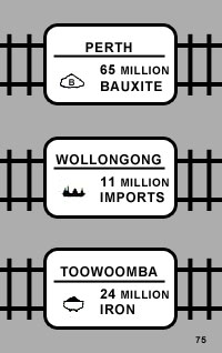 Demand cards tell you what to do in Empire Builder. Each one lists three different cities, each of which wants a different good. You pick one of those goods to deliver to one of those cities and then you receive a payout.
This might have all worked somewhat well in the original Empire Builder, which was set in the United States, but as the series expanded to different locations it start centering games on maps that people were less familiar with. As a result you now had to constantly look up where each item was available at and then where both those source cities and the destination cities were located on the map. Mayfair tried to make this easy by including reference charts listing where everything was, but it meant that there was always a lot of looking up of locations whenever you got a new demand card.
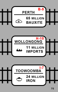 If there's one thing that The Settlers of Catan taught us, it's that things don't have to be this way. You can incorporate a lot of game information on the cards and other components that you include in a game. And, I think this is the place to really start redesigning Empire Builder.
Nearby I've mocked up a card from Australian Rails (above right) and then I've offered a simple variant (left) of it which simply lists the map grid location of the destination city. With a day or two's work you could probably revamp all the existing cards without changing their layout, and you'd end up with a game that had, perhaps, 20% more usability.
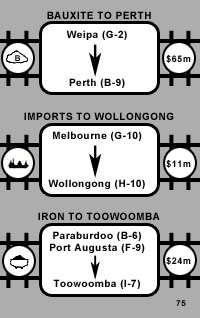 Of course this is in no way the be-all or end-all. Better would be to list all the places where your goods could come from as well. So I tried this out in the new card design that you can see nearby (right). It indeed has all of the information: where a good comes from as well as the grid locations for both those sources and the destinations.
I have no doubt that this card does the job. However, it also loses a lot of the simple elegance of the original design, and there's no good focus on the two most important factors: goods and destination. Instead everything mashes together into a singular whole.
This card design stuff can be tough.
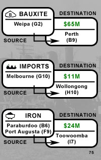 I'm happier with my second try at the same, left, which I think makes the information easier to quickly assess. I'm sure it could be better, but I'm putting together a quick sample rather than actually doing a graphic design. The main point is that all the information is in one place, rather than requiring flipping through a booklet or memorizing a bunch of information. I think Settlers has really shown the power of this type of design.
I think another thing that Settlers taught us, which I wasn't able to mock up here, is the value of graphical information in place of simple text. In my ideal card design for Empire Builder each demand would be graphically depicted via a map. You'd see the overall area covered by the game, with source cities marked in red and the destination city marked in green. Maybe there'd even be lines between these points listing the minimal costs for getting from one place to the other, to make it easier for you to assess which source you wanted to go to.
The problem with this final possibility is that the teeny little cards, with three demands each, can't really accomodate it. You'd either need larger cards or, more rationally, you'd need to put a single demand on a card rather than three, and that delves further into upsetting the base design of Empire Builder than I want to this week.
Conclusion
If I've offered one insight into game design this week, I hope it's that graphic design is very important. I'm fairly convinced that The Settlers of Catan has succeeded as one of the best-selling Games of Ours not just because of its gameplay, but also because of its very good and utilitarian graphic design sense. Empire Builder shows how non-utilitarian component design often was just one gaming generation before Catan, but also how there's simple room for improvement.
Next time I'm going to finish up my survey of Empire Builder by talking about some of the other design that could be overhauled to create a richer, and generally improved, twenty-first century game.
PS: Game Store Confidential should be back in this space next Monday.
6 comments:
Great idea. I like your design on the cards, but I think the game needs some BIG changes to keep the game down time. I can't wait to see your next article on the subject.
Actually, Shannon, there already exists a great redesign of Empire Builder. It's called Funkenschlag! :-)
I like the picture idea, but agree that it could get pretty crowded on the card. One solution might be to draw cards in sets of three, only one of which could be completed. This would have two effects, one good and one bad. The good is that it would provide even more variablility in the game because particular contracts wouldn't be tied together in groupd of three. Counterbalancing that is the idea that during design the loads on a given card are on the same card for a reason.
Another approach that would change the game more, but maybe not too much would be to have a map with three contracts pictured on the same map with different colors and have all the yellow routes pay $X, the red, $Y, etc.
Well written, Shannon.
The card mockups that you provided show a wonderful progression, making information quickly available and the game easier to play.
I look forward to other articles talking about game design (especially usability), and wonder if you would actually dissect the game that you held up as an example. Exactly what has Settlers of Catan taught you about game design? Where are it's strengths? Weaknesses?
Having recently written Publishing Games of Superior Functional Design I found your post to be highy interesting and entertaining. There is so much that can go into enhancing the usability of these games we play. These enhancements should if anything reduce game play time or, at the very least, allow us to devote more of our attention to a game's meaningful decisions.
I love your ideas for the cards making the game easy to play indeed.
I actually designed the Preliminary version of Australian Rails back in 1989. It took them some years (1994) to get around to publishing it. When I designed the game I wanted to have some events that were "board interactive" in a way that would not only delay players like snow storms, but that would affect the map based on Australia's desert terrain, hence the sand storms and rivers drying up events.
Mayfair imported a number of these into Iron Dragon later. I would love to see the games updated in the ways you've described!
Post a Comment